

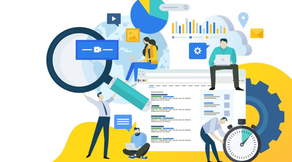
Nobody is stopping you if you choose to rely on yourself instead of Republic Malaysia to build your own website, but you better know what you are doing. Otherwise, you end up dirtying the wall by throwing random tomatoes without thought just to see which sticks.
Ideally, your website must be comfortably browsed without unnecessary interruptions or inconveniences that will convince your readers about the uselessness of this digital slop you spawned before they ultimately leave. Remember that first impressions count. Even a small mistake in the homepage will let the reader know that something is probably up.
So what obnoxious design will you have to learn and avoid, unless you know the rules well enough to bend them for aesthetic or zany reasons?
Pop ups
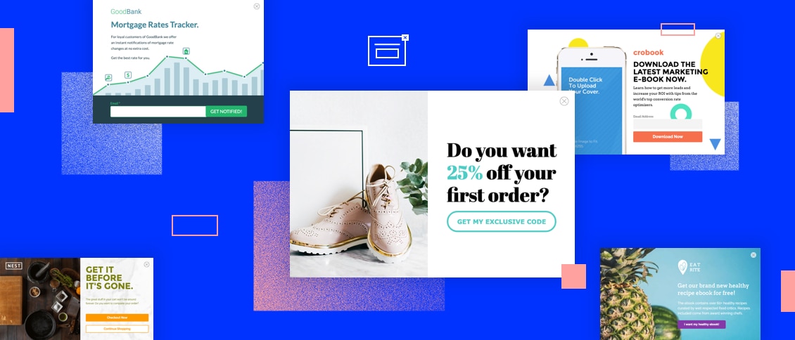
Pop ups are what happens when punches are manifested on-screen, because getting one is the digital equivalent to a jab to the nose. It is sudden, and it hurts. This is very annoying when you are browsing something only to get a pop up in the middle.
If you were surfing the Internet in the 2000s or that website is already riddled with enough malicious elements or files, the pop ups you will get were even more obnoxious. Remember the time when you were browsing as a kid and a seizure inducing window tells you that you are winning a free iPhone?
It is worse if you are browsing your website with a phone, because the pop ups are more of a hassle to close when you have to actively find the exit button.
If you have to include a pop up, at least make it so it is triggered at the end of your website or when you leave. Do not include pop ups in your website’s mobile version at all.
Hamburger menus
Hamburger menus are so called because their buttons are three horizontal lines stacked on each other like a burger. Now this might not be an issue for mobile users as it is necessary to save space in their devices’ small screens.
Desktop websites, however, are not an ideal place to include a hamburger menu because your readers may be initially confused when they are navigating for pages such as contacts and features only to find that they are not outright visible until the burger is opened.
They might also not be able to easily access important information.
Pre loaders
There is a reason why you shouldn’t cram images, videos, and other effects programmed with JavaScript in one page. As cool as they may look, a pre-loader will appear whenever you want to access that page. The more complex they are, the longer it will take to load.
Because of this, waiting in a pre-loader is akin to digital purgatory. Nobody wants to wait so long just to see a single page. This isn’t a dial up internet period anymore, so there is no excuse to make sure that your contents load as fast as they can.
The funny irony is that pre-loaders can improve your page’s speed rating. Still, your readers won’t give two dirts about it and may leave if they have a very short attention span.